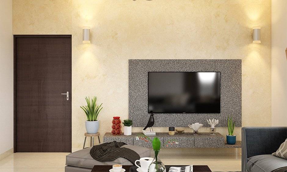
A room does not need a major renovation to feel brighter, more spacious, or more inviting. Sometimes, a thoughtful color choice and a well-planned painting project can change how the entire space looks and feels. From compact bedrooms to narrow hallways and small home offices, paint can help create a visual balance that makes a room more comfortable to use.
Choosing the right Interior Paint involves more than selecting a color from a sample card. Lighting, wall condition, furniture, finish, and the relationship between adjoining rooms all influence the final result. Understanding these factors before starting can help homeowners make confident decisions and avoid costly repainting.
Start by Understanding the Room’s Natural Light
Natural light has a significant impact on how paint colors appear. A room with large windows may show colors differently from one with limited daylight, even when the same paint is used.
Before choosing a shade, observe the room at different times of day. Notice whether sunlight reaches the walls directly, whether nearby buildings create shadows, and how the room looks when artificial lighting is switched on.
Lighter shades such as soft white, pale beige, and muted gray can help reflect available light and create an airy atmosphere. However, a room does not automatically look better when painted pure white. Depending on the lighting and surrounding finishes, a warm off-white or subtle neutral may feel more comfortable.
In rooms with limited daylight, avoid choosing a color based only on how it looks in a brightly lit showroom. Testing a sample on the actual wall provides a more reliable impression.
Use Color to Create Visual Continuity
Small spaces can feel crowded when too many contrasting colors divide the walls and architectural features. Using related shades throughout a room can create a more continuous appearance.
For example, a light neutral on the main walls paired with a slightly different shade on the trim can add definition without creating a strong visual break. In narrow hallways, keeping the color scheme consistent between connected areas may also help the home feel more cohesive.
This does not mean every surface must be identical. Subtle variations in tone can introduce depth while maintaining a unified look.
Consider the colors already present in the space, including flooring, cabinetry, furniture, curtains, and decorative pieces. Selecting paint that works with these existing elements often produces a more balanced result than choosing a shade in isolation.
Choose Accent Walls With a Clear Purpose
An accent wall can add personality to a compact room, but its placement matters. A darker or more saturated shade can draw attention to a particular feature, such as a headboard, fireplace, reading nook, or architectural detail.
Before creating an accent wall, decide what you want people to notice when they enter the room. Painting a wall simply because it is available may make the space feel visually unbalanced.
In a small bedroom, for example, a muted green or deep blue behind the bed can create a focal point while leaving the other walls in a lighter neutral. In a small home office, a carefully chosen accent color can define the work area without requiring additional furniture or decorative elements.
Keep the rest of the room relatively coordinated so the accent color feels intentional rather than disconnected.
Select the Right Finish for Everyday Use
Color is only one part of the decision. The paint finish affects appearance, cleaning requirements, and how imperfections show on the wall.
Flat and matte finishes generally reduce reflections and may help make minor surface irregularities less noticeable. Satin and eggshell finishes offer a different balance of appearance and cleanability, depending on the product. Higher-sheen options can be useful for selected trim and surfaces where durability or frequent cleaning is important.
The best choice depends on the room’s use and the condition of its walls. Busy hallways, kitchens, children’s rooms, and other frequently used spaces may require a finish designed to handle regular cleaning.
Always review the product specifications before making a final choice. Different paint lines can vary in durability, washability, and recommended applications, even when their finish names sound similar.
Prepare Walls for a More Consistent Result
Paint can emphasize surface problems rather than hide them. Small dents, cracks, peeling areas, and uneven patches may become more noticeable once the new color dries.
Begin by inspecting the walls under good lighting. Remove dust and suitable surface contaminants, repair minor imperfections with an appropriate filler, and sand repaired areas as directed. Allow cleaned or repaired surfaces to dry before continuing.
Primer may be necessary when working over significant color changes, bare surfaces, repaired patches, stains, or materials that require improved adhesion. The correct primer depends on the existing surface and the paint system being used.
Preparation also includes protecting floors, furniture, electrical fixtures, and trim. Applying painter’s tape carefully around edges can help create cleaner lines, although tape should be used according to its instructions and removed at the appropriate stage.
Taking time with preparation can make the application process easier and improve the overall appearance of the finished room.
Test Paint Colors Before Covering the Entire Room
A color that looks attractive online or in a store may appear different in your home. Screen settings, lighting conditions, surrounding colors, and the size of the sample can all influence perception.
Use sample paint or approved sample cards to compare a few shortlisted shades. View them on different walls and check their appearance in both daylight and artificial light.
Avoid evaluating a color only when it is freshly applied. Let sample paint dry fully, following the product’s instructions, before judging its final appearance.
It can also help to compare the samples with flooring, countertops, curtains, and furniture. A neutral shade with a subtle undertone may coordinate beautifully with one set of materials but clash with another.
Limiting the shortlist to a few suitable options makes the decision more manageable and reduces the temptation to keep changing colors during the project.
Plan the Painting Process to Avoid Uneven Coverage
Once the color and finish are selected, calculate the approximate amount of paint required. Measure the wall area and account for doors, windows, surface texture, and the number of coats recommended by the manufacturer.
Paint coverage varies by product and surface, so use the label’s coverage guidance rather than relying on a universal estimate. Buying enough paint from the same product line and, when possible, a consistent batch can help maintain color consistency across the room.
Use suitable brushes for corners and detailed edges, along with a compatible roller for larger wall sections. Apply paint according to the recommended method and drying time. Rushing between coats can affect the finish and lead to unnecessary touch-ups.
Keep the room ventilated as directed on the product label, and protect the freshly painted surface while it dries and cures.
Bring the Room Together With a Coordinated Palette
After choosing the main wall color, consider how the remaining elements will work together. Trim, doors, ceilings, and adjoining rooms can either support the main color or introduce too much contrast.
A simple palette often works well in smaller spaces: one primary wall color, one complementary trim color, and a limited number of accent shades in furnishings or décor.
Warm neutrals can pair well with natural wood and cream fabrics, while cooler neutrals may complement certain stone finishes, metal details, and contemporary furnishings. These are useful starting points rather than strict rules; the actual combination should be judged in the room’s lighting.
For homeowners exploring Interior Paint options, Conwell Hardware offers paint products from Benjamin Moore, with color-matching services available to help with selecting or recreating a suitable shade.
Conclusion
Making a small room feel more open begins with understanding its lighting, choosing a coordinated color scheme, and selecting a finish that suits everyday use. Careful surface preparation and realistic color testing can also prevent common problems and reduce the need for repeat work.
Instead of relying on one universal shade or finish, consider how each choice will work with the room’s size, natural light, furnishings, and practical requirements. With thoughtful planning and the right Interior Paint, even a compact space can feel brighter, more cohesive, and better suited to the way you live.