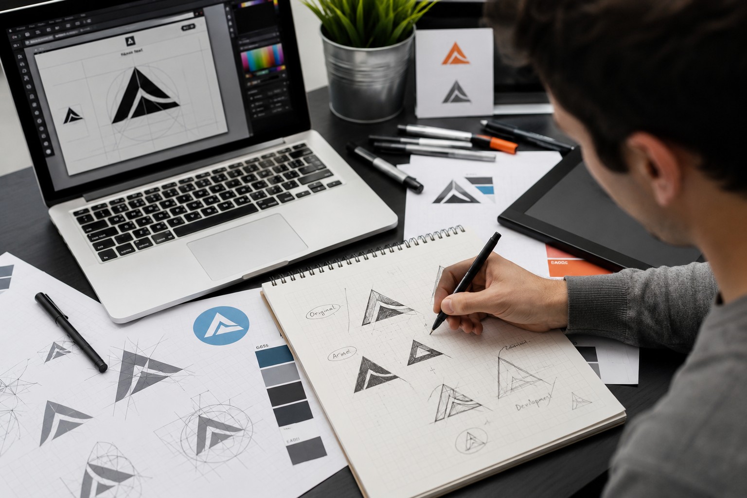
In a crowded digital marketplace, businesses have only a few seconds to make an impression. Before customers read your headline, explore your products, or contact your team, they often notice your visual identity. That is why logo design is far more than choosing a symbol and placing a company name beside it.
A memorable logo can communicate personality, professionalism, and purpose without saying a single word. It can make a new business look established, help an existing company remain recognizable, and give customers a visual reason to remember the brand.
But what separates an ordinary logo from one that people actually remember?
A Great Logo Tells a Story Without Words
Think about the brands you recognize instantly. You may not remember their advertising campaigns or product descriptions, but their visual symbols can immediately bring the company to mind.
That is the power of effective logo design.
A successful logo does not need to explain everything about a business. Instead, it creates a visual impression that supports the company’s personality. A modern technology company might use clean geometry, while a creative studio could choose something more expressive. A premium brand may rely on elegant typography and restrained colors.
The goal is to create something meaningful without making it complicated.
First Impressions Start With Visual Identity
Customers naturally make judgments based on presentation. A polished visual identity can suggest that a company pays attention to quality and professionalism. A confusing or outdated identity may have the opposite effect.
This does not mean every business needs an elaborate logo. In fact, simplicity is often more powerful.
Consider how a logo will appear on a website header, social media profile, business card, product package, or mobile screen. If the design remains recognizable in all of these places, it has a much better chance of becoming a valuable brand asset.
Why Simplicity Wins
One of the biggest mistakes businesses make is trying to put too much information into a logo.
Multiple icons, complicated illustrations, excessive colors, and decorative fonts can make a design difficult to understand. When customers see the logo for only a moment, they may not have enough time to process all those details.
Simple designs are easier to recognize and remember.
A strong logo might use one distinctive symbol, carefully selected typography, and a limited color palette. Every element has a purpose, and nothing competes for attention.
The result is an identity that can work equally well on a large sign and a small smartphone screen.
Your Audience Matters More Than Design Trends
A logo should not be designed simply because a particular style is popular this year. Trends can provide inspiration, but your audience should remain the priority.
Ask yourself who you want to attract.
Are your customers looking for reliability? Innovation? Luxury? Affordability? Creativity? Tradition?
These answers can influence the visual direction of the brand.
For example, a financial business may benefit from a clean and trustworthy identity, while a children’s entertainment company could use brighter colors and playful shapes. A professional designer considers these differences before developing concepts.
This audience-first approach helps ensure that the finished identity feels appropriate rather than simply fashionable.
Color Can Change the Entire Feeling
Color is one of the fastest ways to influence perception.
Blue can create feelings of trust and stability. Green can suggest growth, nature, or freshness. Red can communicate energy and confidence. Black can create a sophisticated or premium impression.
However, there is no universal rule that says one color belongs to one industry. What matters is how the complete combination of colors, typography, shapes, and imagery supports the brand.
Businesses should also think about consistency. Once primary colors are selected, they can become part of the company’s broader visual identity across websites, social media, packaging, advertisements, and printed materials.
Typography Is More Powerful Than It Looks
Sometimes the most recognizable part of a brand is not an icon but its lettering.
Typography can completely change how a business feels. A traditional serif typeface can communicate heritage and authority. A modern sans-serif font can feel clean and approachable. A carefully selected custom type treatment can make the identity feel distinctive.
The important thing is readability.
A logo should still be understandable when customers see it quickly or at a small size. Decorative fonts may look attractive in a presentation but become difficult to read when reduced.
Good typography combines personality with practicality.
When Custom Design Makes Sense
Templates can be convenient, but businesses that want a distinctive identity often turn to custom logo design services.
Custom work allows the visual identity to be developed around the specific business rather than forcing the business into a pre-existing template. Designers can explore original symbols, lettering, color combinations, and concepts based on the company’s goals.
For businesses considering custom logo design services, it is worth thinking beyond the initial design. Ask whether the final identity can work on social media, websites, packaging, merchandise, signage, and print materials.
A logo should be designed for real-world use, not just for a presentation screen.
Make Your Logo Flexible
Your brand will probably appear in more places than you expect.
Today, you might need a logo for a website and Instagram profile. Tomorrow, you may need it for product packaging, uniforms, brochures, storefront signage, or promotional merchandise.
That is why flexibility matters.
A professional logo should remain recognizable when resized and should work on both light and dark backgrounds. Many businesses also benefit from having different versions, such as a horizontal logo, stacked version, icon-only mark, and monochrome variation.
These variations make branding easier without sacrificing consistency.
Don’t Forget the File Formats
A beautiful logo can become frustrating if you receive only one unsuitable file.
Businesses should ideally have access to both vector and raster versions of their identity. Vector files such as AI, EPS, and SVG can be scaled without losing quality, while PNG and JPEG files are useful for many everyday digital applications.
Having the right files means you do not have to recreate the logo every time you want to use it somewhere new.
It also makes collaboration easier when working with printers, developers, marketers, advertising platforms, and other vendors.
Logo Outlets: Turning Ideas Into Brand Assets
Choosing a design partner can make the branding process considerably easier. Logo Outlets focuses on creating visual identities that are designed for practical business use rather than simply looking attractive in a portfolio.
A good designer listens to the business owner, studies the market, considers the audience, and develops concepts that have a clear purpose.
Logo Outlets also emphasizes the importance of creating branding that can adapt across different platforms. This approach gives businesses more confidence when using their identity as they grow.
Avoid the Copy-and-Paste Trap
One of the easiest ways to weaken a brand is to make it look like everyone else.
If every competitor uses the same colors, symbols, fonts, and layouts, customers have little reason to remember one business over another.
Researching competitors is useful, but the purpose should be differentiation.
Look for opportunities to establish your own visual personality. Perhaps your industry is filled with complicated logos, and a clean minimalist identity would stand out. Maybe competitors rely heavily on generic symbols, creating an opportunity for a more distinctive concept.
Being different does not mean being strange. It means being recognizable for the right reasons.
Build Consistency Around Your Logo
A logo works best when it becomes part of a larger brand system.
Use consistent colors, typography, imagery, and messaging across your customer touchpoints. When someone visits your website, sees your social media post, receives your email, or encounters your packaging, the experience should feel connected.
This consistency builds familiarity.
Over time, customers begin to associate those visual elements with your company automatically. That recognition can become especially valuable as your business expands.
Think Beyond Today’s Trend
A logo should look modern, but it should not become outdated as soon as the trend disappears.
Ask whether the design will still make sense five or ten years from now. Will it work if the company introduces a new product? Can it adapt if the business expands into another market?
These questions encourage a long-term approach to branding.
The strongest identities are not necessarily the most complicated or fashionable. They are the ones that remain recognizable while allowing the business to evolve.
Final Thoughts
Great branding begins with a clear understanding of what a business represents and who it wants to reach. Logo design brings those ideas together through shapes, typography, colors, and visual personality.
A memorable identity should be simple, relevant, flexible, and distinctive. It should work across digital and physical platforms while remaining recognizable as the business grows.
For companies exploring custom logo design services, choosing a professional approach can turn a basic visual mark into a long-term brand asset.
Logo Outlets understands that a logo is often the beginning of a customer’s relationship with a business. When that first visual impression is thoughtful, consistent, and memorable, it can help a brand stand apart in a crowded market.
Your logo may only take a moment to see, but the right one can take years to forget.